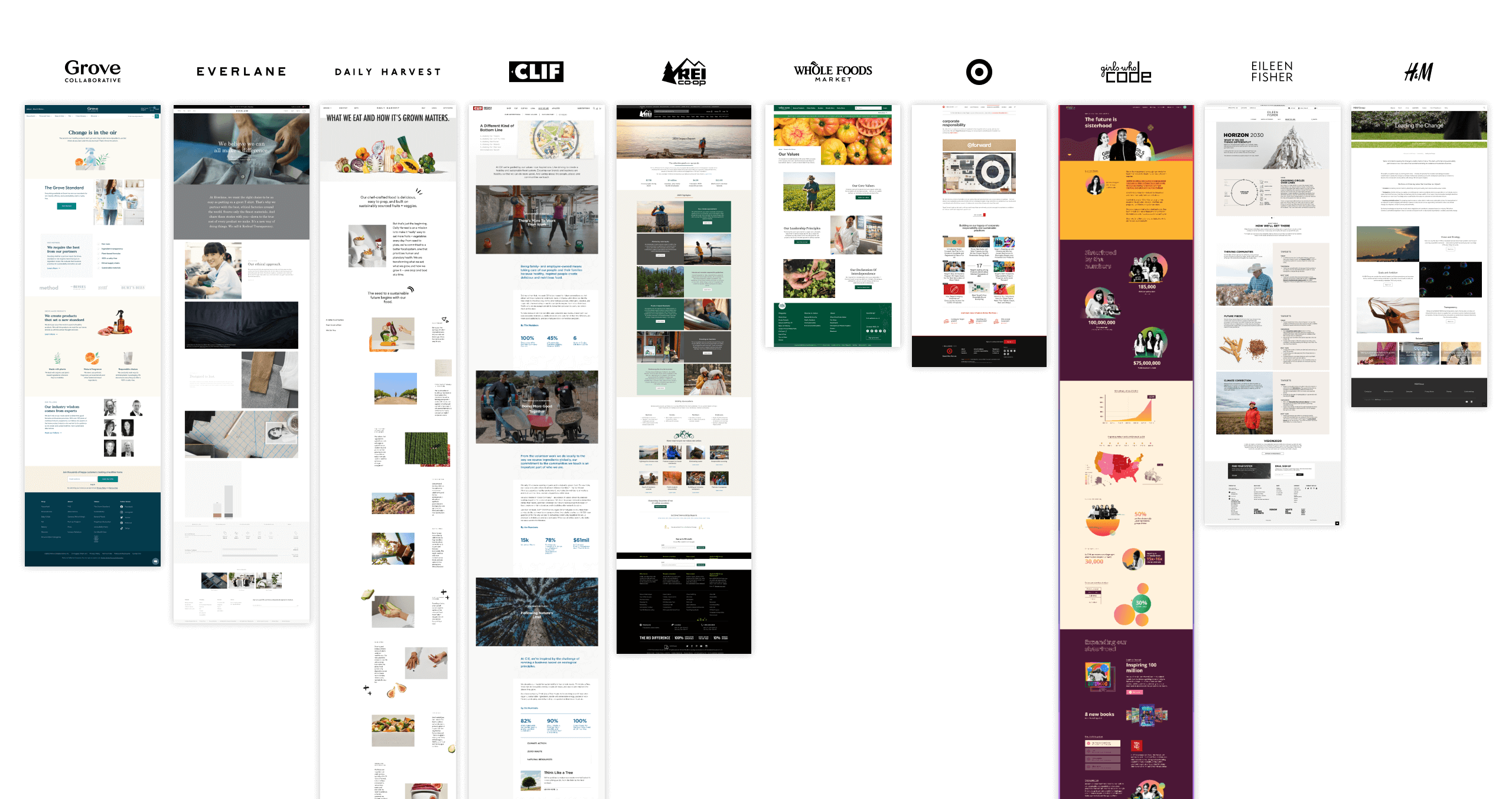
Before we could start strategizing, we took a look at brands across categories (retail, apparel, direct to consumer, and more) to understand the various ways they communicate purpose.
As we compiled different brands to look at, we asked ourselves these following questions to understand what makes a brand purpose page successful:
Is their purpose clear?
What’s the narrative structure?
Who is it for?
What is the content taxonomy?
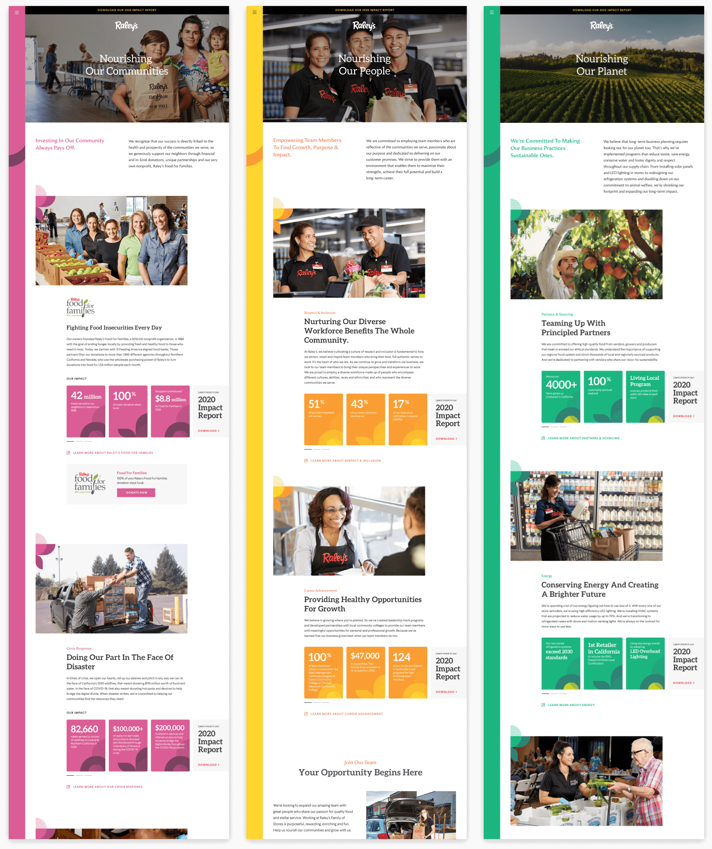
Because Raley’s already provided us a document with all of the content they wanted on the site, the challenge for us was to organize it in a way so that the information is presented in a concise structure that is visually interesting and easy to scan.
After referencing our findings from our competitive analysis and our audit of the content Raley’s provided us, we created the following content structure.

We wanted to use the Raley’s brand elements to give a sense of friendliness and hope to communicate that Raley’s is a purpose driven company. We used 4 of the brand colors to differentiate the pillars and make the content feel approachable.
.png)