For the MVP Portacool mobile app, the client provided us their research and initial requirements which we executed and refined on. After working with the product manager, we finalized the requirements to the following:
Requirements
Account Management
Basic Cooler Configuration
Multi-Cooler Support
Wi-Fi Configuration & Setup
Cloud Connectivity - Control
Error Alerting
Cooler Onboarding
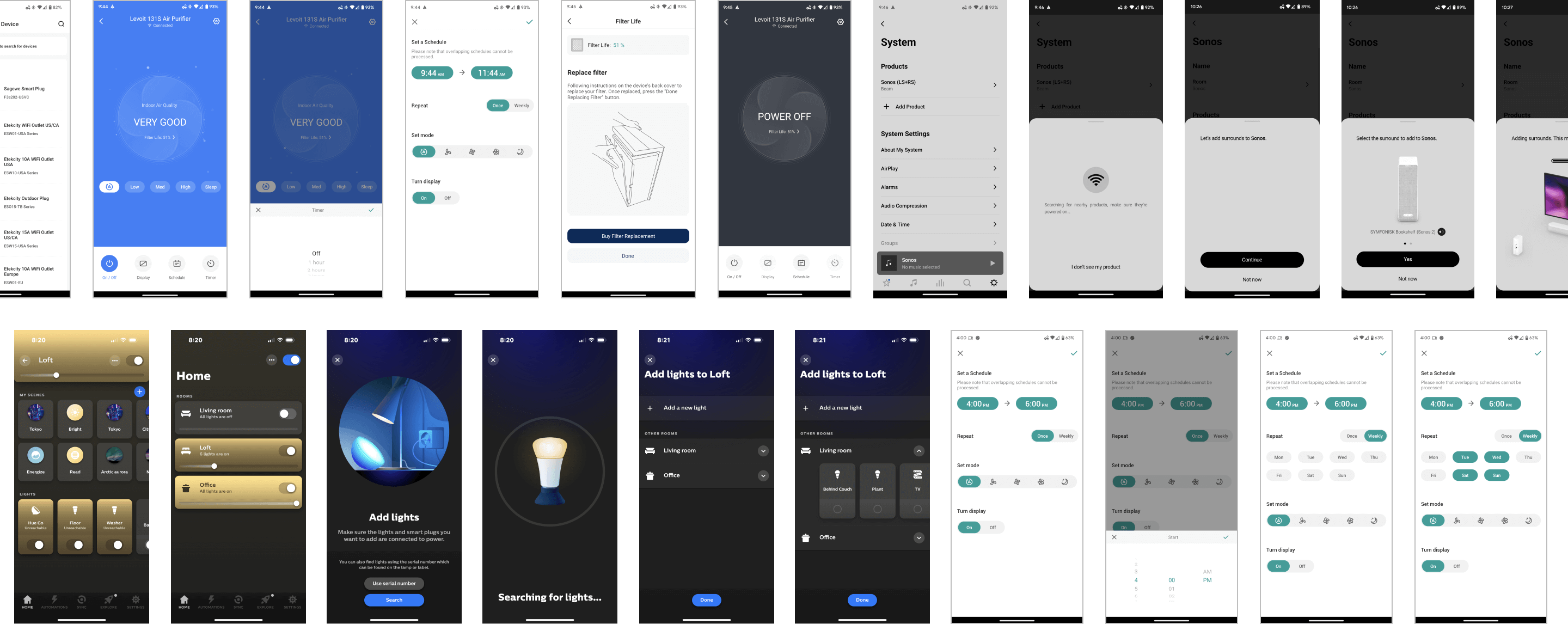
In order to dive into this project, I researched competitors and other smart device automation apps, carefully examining their features and hierarchy. This helped with gaining valuable insights, spotting opportunities, and fine-tuning our approach for a great user experience.
I identified the 4 main stages of the user journey based on the requirements we finalized.

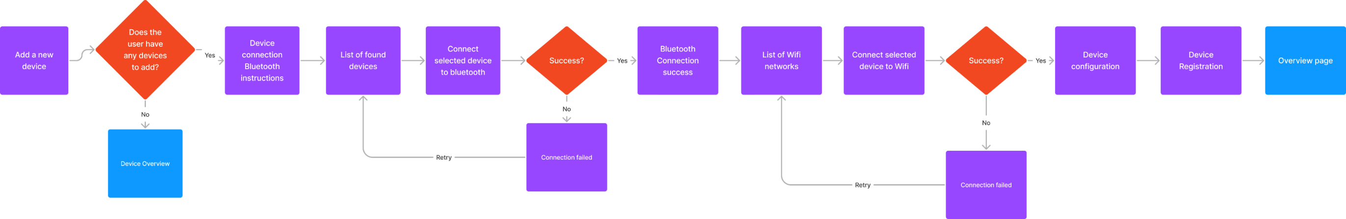
Additionally, because the cooler onboarding phase is a bit different than other device onboarding phases, I identified its user journey flow in order to understand how the experience would work.
With the goals, features and processes mapped out, I moved into the next phase of creating wireframes to visualize the information architecture and determine the functionality in the interface.
.png)
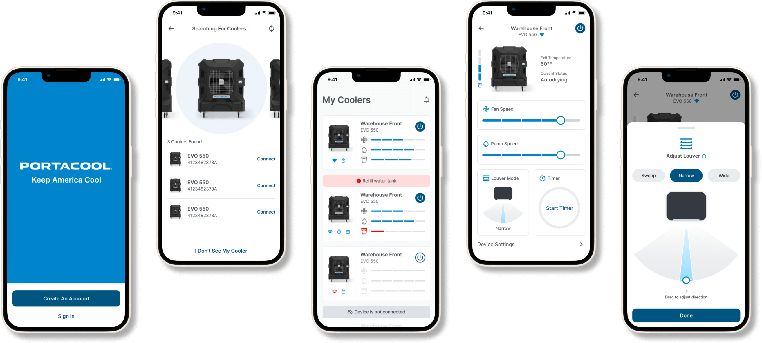
Once wireframes were finalized, I started building out designs based on Portacool’s brand guide while also continuing to improve the user experience through exploration. Because Portacool’s users are generally working in mainly industrial environments, I kept the visuals very minimal, clean and to the point.
After several explorations of the device selection screen in the cooler onboarding phase, we decided to go with the solution that made it easy to browse through 10+ available coolers. Even though initially most users will only have 1-3 devices available, we decided on the layout that would be easy to navigate for even edge cases of 10+ devices.
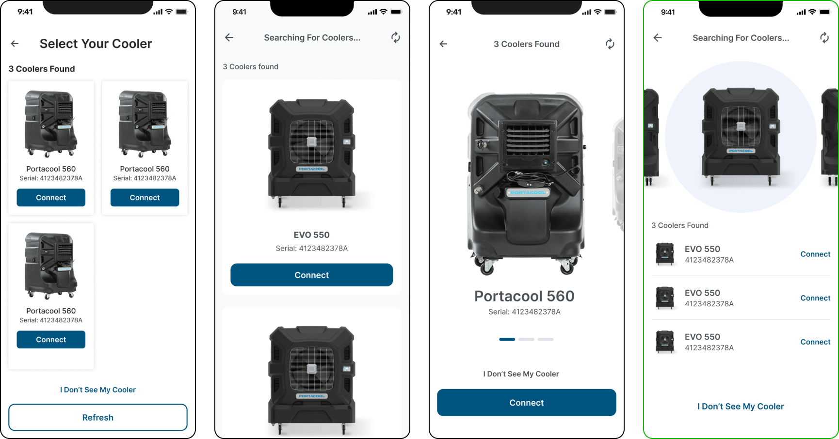
Examples of cooler onboarding explorations. Selected option is outlined in green
A major challenge with the cooler overview screen was navigating the fine line of showing too much information vs showing too little information. After several rounds of exploration, we went with the solution that most closely resembled the physical controls on the hardware which more users are familiar with.

Examples of cooler overview explorations. Selected option is outlined in green
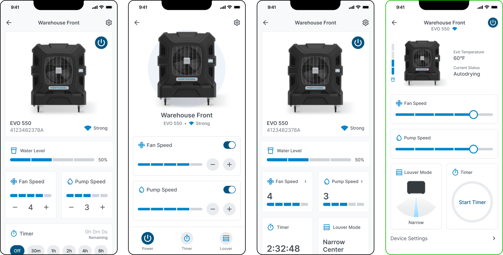
One of the biggest challenges of this project was organizing the various features in these coolers into a succinct page that didn’t look too overwhelming to the user while also making sure changing a setting isn’t too tedious to accomplish. After going through several rounds of exploration which included exploring which features should be readily available vs which ones can be accessed on another screen(drawers, popups), the solution we decided on made adjusting the power, fan speed and pump speed accessible on the main cooler details page. Features such as adjusting louver mode and timer and changing device settings would be accessible through tapping on their respective cards.
Examples of cooler details explorations. Selected option is outlined in green